Dissecting Brainwave and Learning to Build Complex Interfaces with React and Tailwind
Every time designers bring mockups in the style of modern AI services, developers start to feel a slight twitch. Neon gradients, complex background grids, decorative crosses at section borders, bento layouts, and parallax. Assembling this neatly without turning the code into a mess of hundreds of scattered Tailwind classes can be challenging.
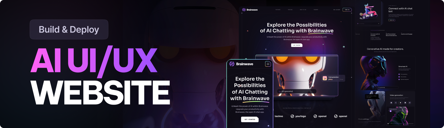
In the brainwave repository, JavaScript Mastery channel author Adrian Hajdin published the source code for a complete landing page for a fictional AI product. The project is built with React, Vite, and Tailwind CSS. This is a great example of how to organize style and component architecture when the design goes beyond standard cards and buttons.
What's Inside the Project
The repository is a ready-made frontend single-page site. It includes all the typical blocks of a commercial website: a hero section with a call to action, feature cards, an interactive roadmap, an integrations section, and pricing tiers.

The main value of the project lies not in the design itself, but in the approach to implementing complex visual elements. Instead of plugging in heavy component library dependencies, the author demonstrates how to get the most out of vanilla Tailwind CSS and pure React.
Interesting Technical Solutions
I reviewed the codebase and identified four techniques that will be useful in real development.
1. Typography Architecture via Tailwind Plugin
In large Tailwind projects, a common issue emerges: developers copy lengthy class chains like font-semibold text-[2.5rem] leading-[3.25rem] md:text-[2.75rem] from one heading to another. This clutters markup and complicates refactoring.
In Brainwave, this was handled through the configuration file tailwind.config.js. Using the built-in function plugin, the author created custom component classes for all typography levels:
plugins: [
  plugin(function ({ addBase, addComponents, addUtilities }) {
    addComponents({
      ".h1": {
        "@apply font-semibold text-[2.5rem] leading-[3.25rem] md:text-[2.75rem] md:leading-[3.75rem] lg:text-[3.25rem] lg:leading-[4.0625rem] xl:text-[3.75rem] xl:leading-[4.5rem]":
          {},
      },
      ".h2": {
        "@apply text-[1.75rem] leading-[2.5rem] md:text-[2rem] md:leading-[2.5rem] lg:text-[2.5rem] lg:leading-[3.5rem] xl:text-[3rem] xl:leading-tight":
          {},
      },
      ".body-1": {
        "@apply text-[0.875rem] leading-[1.5rem] md:text-[1rem] md:leading-[1.75rem] lg:text-[1.25rem] lg:leading-8":
          {},
      },
      ".tagline": {
        "@apply font-grotesk font-light text-xs tracking-tagline uppercase":
          {},
      },
    });
  }),
]
Now in JSX you just need to write <h1 className="h1">, and styles are pulled in automatically along with responsive breakpoints.
2. Universal Section Wrapper with Guide Lines
The project design uses thin divider lines along the sides of the page and decorative crosses at block intersections. Building this markup manually inside each component is inconvenient.
The project includes a dedicated Section.jsx component that handles all the decorative geometry:
import SectionSvg from "../../public/assets/svg/SectionSvg";

const Section = ({
  className,
  id,
  crosses,
  crossesOffset,
  customPaddings,
  children,
}) => (
  <div
    id={id}
    className={`relative
    ${
      customPaddings ||
      `py-10 lg:py-16 xl:py-20 ${crosses ? "lg:py-32 xl:py-40" : ""}`
    } ${className || ""}`}
  >
    {children}

    <div className="hidden absolute top-0 left-5 w-0.25 h-full bg-stroke-1 pointer-events-none md:block lg:left-7.5 xl:left-10" />
    <div className="hidden absolute top-0 right-5 w-0.25 h-full bg-stroke-1 pointer-events-none md:block lg:right-7.5 xl:right-10" />

    {crosses && (
      <>
        <div
          className={`hidden absolute top-0 left-7.5 right-7.5 h-0.25 bg-stroke-1 ${
            crossesOffset && crossesOffset
          } pointer-events-none lg:block xl:left-10 right-10`}
        />
        <SectionSvg crossesOffset={crossesOffset} />
      </>
    )}
  </div>
);
The component isolates the logic for rendering side guides (w-0.25 h-full bg-stroke-1) and horizontal dividers with SVG icons at intersections. Other blocks simply wrap in <Section crosses>, maintaining a clean structure.
3. Bento Layout for Roadmap
The Roadmap section is built as an asymmetric grid. Even-numbered cards shift vertically on medium and large screens using the even:md:translate-y-[7rem] class.
Gradient borders use a double-wrapper technique: the outer container gets a gradient background (bg-conic-gradient) with minimal padding p-0.25, while the inner block fills with the main dark theme color bg-n-8. This creates a clean glowing border just a fraction of a pixel thick without heavy CSS filters.
4. Extracting Content to Constants
All text, navigation structure, pricing, and feature lists are extracted to the constants/index.js file. Components themselves contain no hardcoded strings—they only handle data mapping. To adapt the project for a real service, you just modify one JS object without touching JSX markup.
How to Run the Project Locally
You'll need Node.js and Git installed to run this. Clone the repository and install dependencies:
git clone https://github.com/adrianhajdin/brainwave.git
cd brainwave
npm install
npm run dev
The Vite local server starts at http://localhost:5173.
Who Will Benefit from This Repository
The project has no backend, database integration, or complex state management. It's specifically a template and learning resource for frontend development.
The repository is worth exploring in two scenarios:
- You want to improve your Tailwind CSS skills and understand how to properly customize the theme for non-standard design mockups.
- You need a ready-made framework for a landing page for your side project or portfolio, where impressive visual presentation matters.
The code is clean, divided into clear modules, and easy to break down into separate reusable components. Source code link: github.com/adrianhajdin/brainwave.
Related projects