How to Get the Most Out of shadcn/ui with shadcn studio
When shadcn/ui first came out, the copy-paste component concept flipped the traditional frontend approach on its head. No more bloated npm packages, breaking updates, and hidden styles. You just copy the component code into your project and modify it however you want.
But over time, almost everyone runs into the downside of that freedom. The base components are minimal, and putting together a decent landing page or dashboard means spending hours building out standard blocks: tables with filters, analytics cards, headers, navigation. Color and theme setup also becomes tedious, tweaking CSS variables at random.
The shadcn-studio project from the ThemeSelection team takes care of this tedious work. It's not a replacement for the original library, but rather an enhancement with ready-made blocks, an interactive theme generator, animations, and integrations for designers and developers.
What's inside shadcn/studio
The repository and project website contain an open collection of extensions for shadcn/ui. The core principle stays the same: no tight dependency lock-in, you only take the code you need.
The developers expanded the base set with several major blocks:
- Ready-made compound blocks (hero sections, features, pricing, headers and footers).
- Page and dashboard templates for quickly launching SaaS applications.
- Animated component variants based on Motion (formerly Framer Motion).
- Interactive theme generator with Tailwind v4 support and OKLCH, HSL, RGB, HEX color space support.
- Figma UI kit and Figma-to-Code plugin for quickly converting designs into code.
- MCP server (Model Context Protocol) to connect the component catalog directly to AI assistants in IDEs like Cursor or Claude Desktop.

Interactive theme tweaking without manual CSS editing
The most tedious part of working with shadcn/ui is selecting the color palette. Usually the process looks like this: you change HSL values in globals.css, refresh the browser tab, check text contrast on buttons and cards, repeat twenty times.
The theme generator in shadcn/studio makes this visual. You adjust the palette in a visual editor and immediately see how actual components change: inputs, badges, modals, and tables.
An interesting detail: the generator is already adapted to the Tailwind v4 specification. It can generate palettes in the modern OKLCH color space, where gradients and shades don't lose vibrancy when transitioning between colors. The ready-made theme config copies with one click.
From simple buttons to ready-made sections
The original shadcn provides atomic elements: button, avatar, dialog, dropdown. The studio, on the other hand, focuses on ready-made variants with different styles and behaviors.
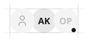
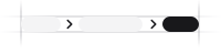
Here's what some basic elements look like in the catalog:
| Avatar | Badge | Breadcrumb |
|
|
|
If you need not just an avatar, but an avatar with online status, a group avatar stack, or a hover profile card popup, the code is already written and neatly organized. The same applies to complex compound blocks. Instead of building a login form from ten separate inputs and labels, you take a ready-made block with validation, social login buttons, and a responsive grid.
MCP server for working with AI in the editor
The developers added support for the Model Context Protocol (MCP). This means that if you write code in Cursor, Windsurf, or use extensions with Claude, you can connect the shadcn/studio context directly to the language model.
You don't need to manually go to the website, copy TSX markup, and explain the component structure to the AI. The assistant via MCP itself requests the specification of the needed block from the catalog and generates a page based on your description in a consistent project design style.
Who will benefit from this project
First and foremost, shadcn/studio saves time for indie hackers and full-stack developers who build their pet projects or startups solo. When there's no in-house designer and the interface needs to look clean and modern, ready-made blocks and theme presets save you from blank page syndrome.
The tool also fits well into commercial custom development on Next.js or Remix, where you need to quickly assemble a prototype admin panel or personal account for client delivery.
The repository is distributed under the permissive MIT license. Component code is open, styles are easily customizable through Tailwind, and all dependencies are transparent. You can view live demos and documentation on the official website shadcnstudio.com.
Related projects